
The Future of Biophilic Luxury: Why Regenerative Design is the New Standard
In the evolving landscape of high-end residential architecture, the definition of "luxury" is undergoing a profound metamorphosis. For decades, opulence was defined by the rarity of materials—imported marbles, exotic hardwoods, and gold-plated fixtures. Today, the most exclusive luxury is not something that can be mined or manufactured; it is the quality of the environment itself. We have entered the era of Regenerative Biophilic Design.
This shift marks a departure from superficial greening—the mere placement of potted plants in a lobby—toward a holistic integration of natural systems into the built environment. As we look toward the future of architecture, it is clear that the most prestigious residences will not just minimize their environmental impact; they will actively improve the health of their occupants and the ecosystems they inhabit.

Beyond Decoration: The Architectural Logic of Regeneration
At its core, Regenerative Architecture treats a home as a living organism rather than a static container. It leverages biophilic principles to create a closed-loop system where architecture serves as an interface between the user and nature.
The logic is architectural, not merely ornamental. It involves:
Active Air Filtration: Utilizing botanical wall systems that function as biological filters, scrubbing volatile organic compounds (VOCs) and particulate matter from indoor air.
Circadian Lighting Integration: Aligning interior illumination with the natural solar cycle to regulate melatonin and cortisol levels, thereby enhancing the psychological well-being of the inhabitants.
Passive Thermal Regulation: Incorporating living thermal masses—such as green roofs or integrated vertical water features—that naturally modulate interior temperatures, reducing reliance on HVAC systems.
When these elements are synthesized, the result is an environment that functions as a high-performance wellness asset. For the high-net-worth homeowner, this is the ultimate investment: a space that works as hard for their physiology as it does for their aesthetic sensibilities.
The Intersection of Wellness and Property Value
Why is this the new standard for the luxury market? The answer lies in the growing evidence linking biophilic design to cognitive function and stress reduction. In high-pressure professional environments, the home has become the ultimate sanctuary.
Regenerative design addresses "nature deficit disorder" by re-establishing the human connection to natural rhythms. From a market perspective, this is a distinct differentiator. Properties that feature integrated green infrastructure demonstrate higher occupancy retention and significant premiums in resale value. This is not just a trend; it is a fundamental shift toward human-centric architecture.
Material Innovation: The Bio-based Revolution
A defining feature of 2026 design is the transition to bio-based composites. We are moving away from traditional synthetic finishes toward mycelium-based acoustic panels, hempcrete insulation, and carbon-sequestering timber frames.
These materials do more than provide a sleek, minimalist aesthetic; they contribute to a "breathable" building envelope. By specifying materials that are non-toxic and carbon-negative, architects are effectively creating indoor microclimates that feel fundamentally different from standard construction. The sensation is one of purity and silence—the new benchmarks of high-end living.

Implementing Regenerative Principles
For those looking to integrate these standards, the transition begins with an audit of the building’s current relationship with its environment.
Light Analysis: Prioritize the maximize of natural daylight through strategic glazing that minimizes thermal gain while optimizing solar heat gain in winter months.
Water Strategy: Implement greywater recycling systems that feed vertical biophilic installations, creating a self-sustaining water loop.
Psychological Zoning: Design spaces that transition from "active" social zones to "restorative" private zones using varying degrees of light, texture, and proximity to green elements.
Conclusion: The New Mandate
The future of luxury is not found in the excessive consumption of resources, but in the sophisticated management of them. As architects and designers, our mandate is to move beyond the aesthetic veneer. We must champion regenerative design as the standard-bearer for modern luxury. By synthesizing advanced engineering with the intuitive grace of nature, we are not just building houses; we are crafting the future of human habitation.

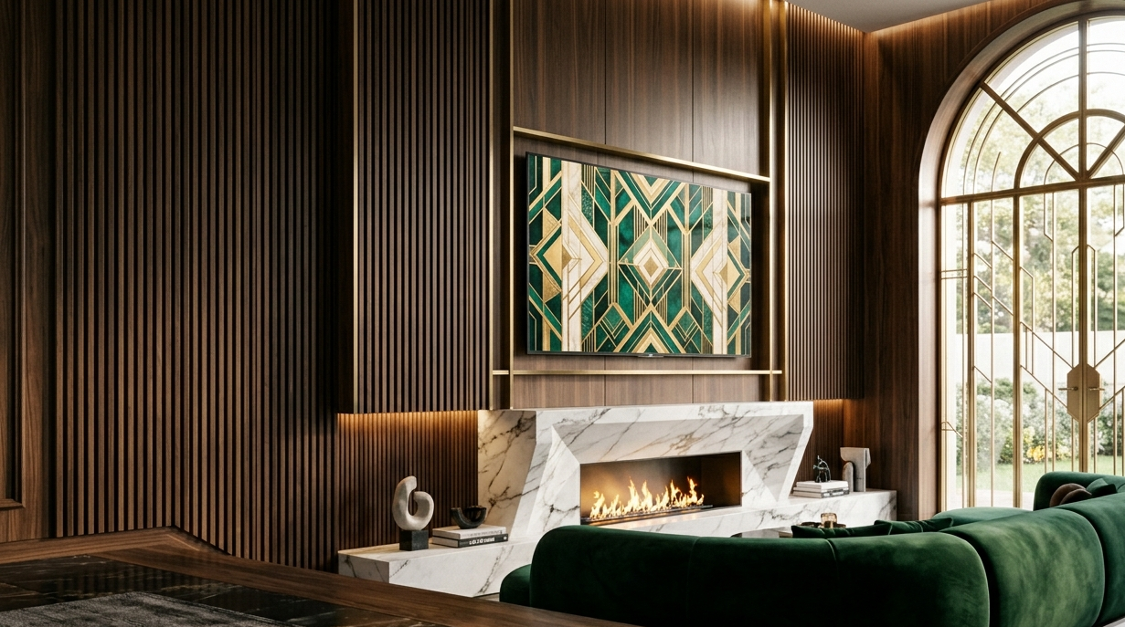
Neo Deco 2026: Reimagining Art Deco for the Modern Smart Home
In the ever-evolving world of interior design, trends often circle back to the past, looking for inspiration in eras that defined elegance. However, in 2026, we aren't just repeating history; we are upgrading it. Enter Neo Deco: a sophisticated, tech-integrated evolution of the classic Art Deco style. It is the perfect marriage between the roaring twenties' opulence and the seamless functionality of the modern smart home.
If you are looking to infuse your living space with contemporary glamour while keeping pace with the demands of a high-tech lifestyle, you have arrived at the right place. Let’s dive into how Neo Deco is redefining luxury home trends this year.
What is Neo Deco?
At its core, Neo Deco is a celebration of geometry, symmetry, and bold expression. The original Art Deco movement of the 1920s was defined by its response to the industrial age—a desire to bring craftsmanship and glamour to mass production.
Fast forward to 2026, and the "Neo" prefix signifies our transition into the era of the smart home. We are no longer designing for just aesthetics; we are designing for convenience, sustainability, and connectivity. Neo Deco captures that timeless, dramatic flair but strips away the stuffiness of the past, replacing it with cleaner lines, warmer textures, and hidden technology that works for you, not against your décor.
The Pillars of Neo Deco Design
To master the Neo Deco look, you don’t need to overhaul your entire house. Instead, focus on these four foundational pillars:
1. Geometric Precision
The hallmark of Art Deco has always been its obsession with geometry. In Neo Deco, this is represented by bold, clean lines. Think of chevron-patterned floors, rounded arches in doorways, and statement furniture pieces with stepped, tiered designs. The goal is to create visual rhythm without visual clutter.
2. Material Richness
Neo Deco loves contrast. We are seeing a massive resurgence in the use of high-quality materials:
Polished Metals: Brass and champagne gold are the metals of choice, adding warmth compared to the harsh silver finishes of the past.
Natural Stone: Veined marble and travertine serve as the anchors of the room, often used in coffee tables or fireplace surrounds.
Sumptuous Textures: Velvet, mohair, and leather provide the tactile experience that makes a home feel expensive.
3. Deep, Atmospheric Palettes
Say goodbye to the "all-white" minimalist aesthetic. Neo Deco thrives in deeper, more mysterious territory. Think of "Midnight Blue," "Emerald Forest," and "Rich Terracotta." These colors provide a sophisticated backdrop that makes metallic accents pop and allows your smart lighting system to create mood-altering scenes with ease.
4. The "Invisible" Smart Home
The most important evolution in 2026 is how we treat technology. In a true Neo Deco home, your devices are subservient to the design. We are seeing:
Voice-activated art: TVs that turn into framed gallery pieces when not in use.
Integrated sensors: Lighting that adjusts based on the time of day, hidden behind Art Deco-inspired crown molding.
Smart furniture: Charging surfaces built into side tables that look like pure marble.

Why Neo Deco is the Ultimate Luxury Home Trend
Contemporary glamour is no longer about showing off wealth; it’s about showing off intent. Neo Deco is popular because it offers a sense of stability. In a fast-paced, digital world, returning to a home that feels structured, warm, and beautiful is a form of self-care. It transforms the "smart home" from a collection of gadgets into a cohesive, high-end living experience.

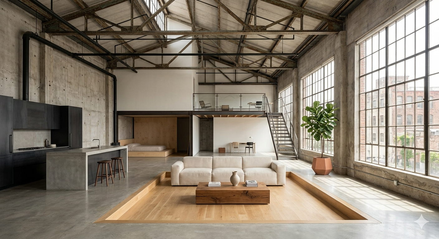
Adaptive Reuse in Architecture: How Industrial Spaces Become Healing Homes
The Kintsugi Loft | Adaptive Reuse
The Kintsugi Loft is a residential renovation project that transforms an abandoned manufacturing warehouse into a functional, multi-generational family home.
Inspired by the Japanese art of Kintsugi—repairing broken pottery with gold lacquer to highlight the cracks rather than hide them—this architectural intervention does not conceal the building's industrial past. Instead, the scars of the old concrete and steel structure are celebrated and integrated with warm, biophilic elements. It explores how we can repurpose the "broken" parts of our cities into spaces of healing and flourishing (Eudaimonia).
The Hook: Why Do Old Spaces Still Matter?
In a world driven by newness, demolition often feels like the default solution.
Old factories, warehouses, and industrial shells are seen as obsolete—
structures that no longer serve a purpose.
But what if their value isn’t in what they were…
but in what they can become?
Adaptive reuse challenges the idea that architecture must start from zero.
Instead, it asks a more complex question:
How do we design with memory?
The Philosophy: Kintsugi as an Architectural Framework
Kintsugi is not just a repair technique.
It’s a philosophy.
Rather than hiding imperfections, it reveals them.
Rather than replacing what is broken, it reinterprets it.
Applied to architecture, this mindset shifts the design process:
from erasing → to integrating
from perfection → to authenticity
from replacement → to transformation
The Kintsugi Loft becomes more than a renovation.
It becomes a dialogue between past and present.
The exposed concrete walls, weathered steel beams, and structural marks are not treated as flaws.
They are treated as evidence.
Evidence of time.
Of use.
Of history.
The Strategy: Adaptive Reuse as a Design Tool
Adaptive reuse is often framed as a sustainability strategy.
And it is.
But its real value goes beyond environmental impact.
It introduces constraints that generate creativity.
In the Kintsugi Loft, the original structure defines the possibilities:
column grids shape spatial organization
ceiling heights influence volume perception
material limitations guide aesthetic decisions
Instead of imposing a new identity, the design works with what already exists.
This results in spaces that feel:
grounded
honest
deeply contextual
The Science: Why These Spaces Feel Different
There’s a psychological dimension to adaptive reuse that often goes unnoticed.
Environments that combine:
natural materials
visible texture
layered history
tend to create a stronger emotional response.
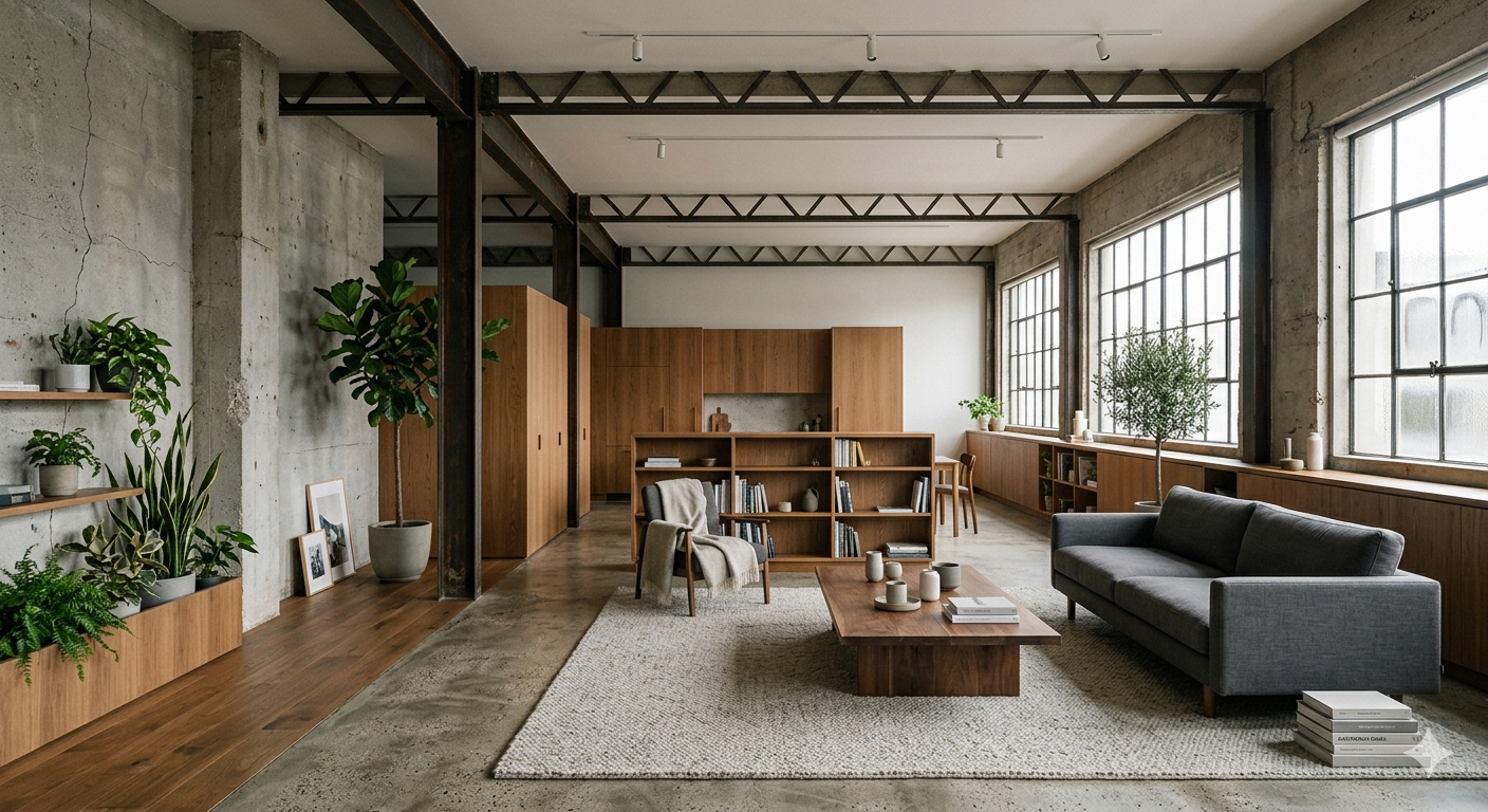
Biophilic design plays a key role here.
By introducing:
natural light
vegetation
warm materials like wood
the project balances the hardness of concrete with elements that promote calm and well-being.
Research in environmental psychology suggests that:
exposure to natural elements reduces stress
textured environments increase cognitive engagement
spatial variety enhances comfort
The result is not just a functional home—
but a restorative environment.
The Design Moves: From Industrial to Intimate
Transforming a warehouse into a home requires more than subdivision.
It requires redefining scale.
Zoning Through Volume
Instead of rigid walls, different ceiling heights and light conditions define spaces.
The Warm-Core Strategy
Private and social areas are anchored by warmer materials—wood, textiles, soft lighting.
Layering Old and New
New interventions are clearly distinguishable, yet complementary.
Nothing pretends to be original.
Nothing feels out of place.
Light as a Connector
Natural light is used to unify the space and soften industrial textures.
The Human Layer: Multi-Generational Living
The Kintsugi Loft is not just about space—
it’s about people.
Designing for a multi-generational family introduces complexity:
privacy vs connection
independence vs shared experience
Adaptive reuse naturally supports this dynamic.
Large, flexible spaces allow for:
evolving needs
shared moments
personal retreats
The architecture becomes adaptive not only in structure, but in use.
The Opportunity: Rethinking “Broken” Cities
Cities are full of underutilized structures.
Abandoned factories.
Empty warehouses.
Forgotten buildings.
They are often seen as problems.
But they are also opportunities.
Adaptive reuse reframes them as:
cultural assets
environmental solutions
architectural narratives
Instead of expanding outward, cities can evolve inward.
3 Practical Takeaways for Design Thinking
Work With Constraints
Limitations often lead to more meaningful solutions.
Embrace Imperfection
Texture, wear, and history create depth.
Design for Experience, Not Just Function
Spaces should support emotional well-being, not just efficiency.
The Risk: Romanticizing the Past
There is a fine line between honoring history and aestheticizing it.
Not every old structure should be preserved.
Not every imperfection adds value.
The challenge is to:
curate what remains
transform what doesn’t
balance memory with functionality
Conclusion: Architecture as Repair
The Kintsugi Loft is not just a project.
It’s a perspective.
It suggests that architecture doesn’t always need to build something new.
Sometimes, it needs to repair what already exists.
Not by hiding its past—
but by giving it a new meaning.
In doing so, it transforms not just spaces…
but the way we think about them.
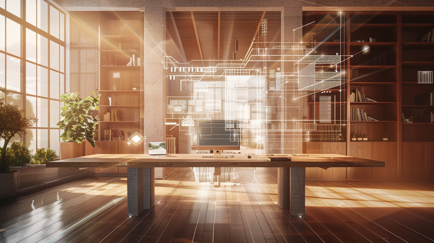
AI in Architecture: How Artificial Intelligence is Transforming Design Workflows in 2026
Architecture has always been a balance between creativity and constraint. But today, that balance is under pressure.
Projects are more complex. Timelines are shorter. Expectations are higher.
And the traditional workflow—sketch, iterate, model, revise—is starting to show its limits.
Design teams are spending more time optimizing than creating. More time fixing than exploring.
This is where Artificial Intelligence is quietly changing everything. Not by replacing architects—but by reshaping how they think, test, and build ideas.
The Shift: From Manual Iteration to Intelligent Generation
One of the biggest bottlenecks in architecture has always been iteration.
Testing multiple layouts, orientations, lighting conditions, or structural options takes time.
A lot of it.
AI introduces a new paradigm: generative design.
Instead of manually creating one solution at a time, architects can now input constraints:
site conditions
climate data
material preferences
budget limits
And AI generates hundreds of optimized design options in seconds.
This isn’t about automation. It’s about expanding the design space.
The Science: Data-Driven Design Decisions
AI in architecture isn’t just visual—it’s analytical.
Tools powered by machine learning can now simulate:
natural light behavior
airflow and ventilation
thermal performance
energy efficiency
In early design stages.
This changes a critical dynamic:
-Decisions are no longer based on intuition alone.
-They’re supported by real-time data.
For example, AI-driven daylight analysis can predict how a space will feel at different times of the day—before it’s even built. This is where architecture starts to intersect with human behavior and well-being.

Key Applications of AI in Architecture
1. Generative Design
AI explores multiple design possibilities based on constraints.
➡️ Benefit: Faster ideation + better optimization
2. Automated Space Planning
AI can suggest layouts based on usage patterns and efficiency.
➡️ Benefit: Reduced manual drafting time
3. Predictive Performance Analysis
Simulation tools analyze energy use, lighting, and comfort.
➡️ Benefit: Smarter sustainability decisions early on
4. Image & Concept Generation
AI tools generate conceptual visuals instantly.
➡️ Benefit: Faster client communication and alignment
5. Construction Optimization
AI predicts costs, materials, and timelines.
➡️ Benefit: Reduced risk and better project control
The Human Question: Will AI Replace Architects?
Short answer: No.
But it will replace how architects work.
AI handles:
repetitive tasks
optimization processes
data-heavy analysis
Which leaves architects with:
strategy
creativity
human-centered design
The real shift isn’t technological.
It’s cognitive.
Architects move from:
“How do I design this?”
to:
“Which of these possibilities is the most meaningful?”
The Opportunity: Designing for Human Experience
This is where AI becomes powerful.
Not as a tool for efficiency—but as a tool for better spaces.
With faster workflows, architects can focus more on:
emotional impact
spatial clarity
well-being
For example:
optimizing light for circadian rhythm
designing calmer environments
reducing sensory overload
AI gives back what the industry has been losing: time to think.
3 Practical Ways to Use AI Today
You don’t need a massive firm to start.
Here are 3 actionable ways:
1. Use AI for Concept Exploration
Generate multiple early-stage ideas before committing.
2. Integrate Performance Tools Early
Test light, energy, and airflow before finalizing design.
3. Improve Client Communication
Use AI-generated visuals to explain ideas faster and clearer.
The Risk: Over-Reliance on Optimization
There’s a downside.
AI tends to optimize for:
efficiency
cost
performance
But architecture is not only about efficiency.
It’s also about:
emotion
identity
meaning
The danger is creating spaces that are “perfect” on paper…
but empty in experience.
Conclusion: A New Design Mindset
AI is not the future of architecture. It’s already part of the present.
The real question is not whether to use it—but how.
Used correctly, AI doesn’t replace creativity.
It amplifies it.
It allows architects to move faster, think deeper, and design with more intention.
And in a world that feels increasingly artificial…
That might be exactly what we need.

Brutalist Architecture: Concrete, Controversy and Renewal
Brutalist architecture emerged in the 1950s as a bold, concrete-driven style born from post-war needs. Despite its polarizing reputation—"love it or hate it"—Brutalism’s raw forms and honest materials have lasting impact. This article explores Brutalism’s history, key characteristics, and its complex legacy in Mexico and beyond. We highlight case studies of iconic buildings and adaptive reuse projects, offering practical insights for designers.

What Is Brutalism? Origins and Definition
Brutalism (from French béton brut, “raw concrete”) originated in post-WWII Britain, championed by architects like Le Corbusier and the Smithsons1. It is defined by exposed concrete surfaces, monumental massing, and geometric rigor. In its heyday (1950s–70s), Brutalism met urgent needs for housing and civic buildings. Concrete offered a “flexible yet solid, malleable yet permanent” solution for large-scale projects.
Key Features:
Material Honesty: Unadorned concrete or brick facades
Monolithic Forms: Blocky, fortress-like volumes
Geometric Patterns: Repetitive grids and deep shadows
Functional Expression: Structures that reveal function (e.g. protruding stairwells)
Brutalist buildings often feel “weighty”, emphasizing volume and gravity. Walking through one, you notice the intricate play of light and space – a unique spatial experience.
Brutalism’s Legacy: Love, Hate, or Indifference
Brutalism has always provoked strong opinions. As a JSTOR analysis notes, it quickly became “an aesthetic only an architect could love,” yet it “continues to elicit strong reactions” today. Critics call it cold and oppressive, while fans celebrate its honesty and sculptural power.
Design-savvy Perspective: For architects and designers, Brutalism’s appeal is clear:
Structural Clarity: No illusions or façades – form follows function.
Durability: Massive concrete can endure for centuries.
Adaptability: Its open, robust spaces can be reimagined (see Adaptive Reuse below).
In Mexico, Brutalist influence appears in modern projects and museum designs. A contemporary ArchDaily article highlights Mexican buildings drawing on Brutalist motifs. We’ll look at specific examples:
1. UNAM Central Library (Mexico City) – Modernism with a Brutalist Touch
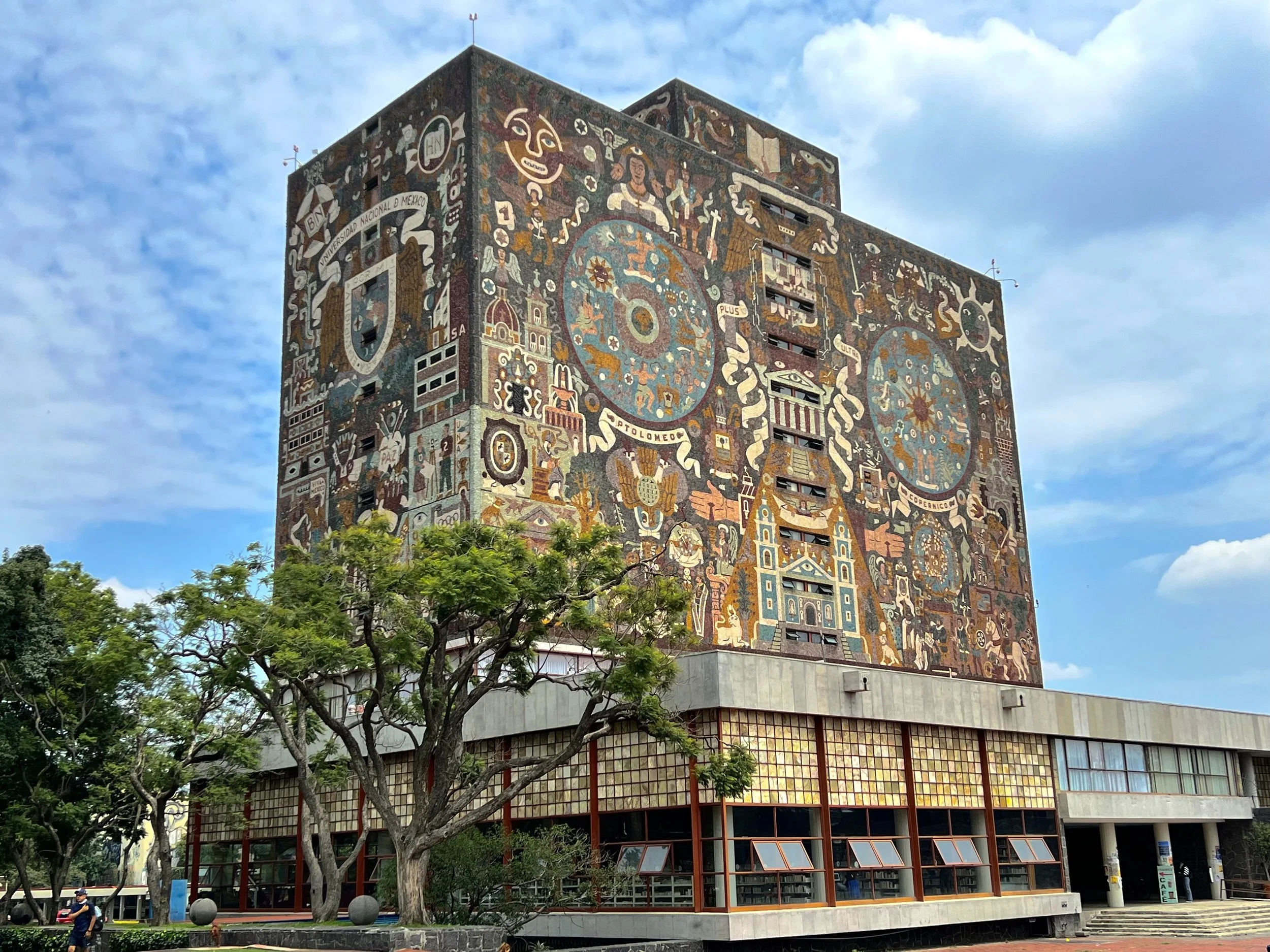
While famous for its mosaic exterior, UNAM’s campus (a UNESCO site) features other concrete forms. The Faculty Tower (Torre de los Ferrocarrileros) by Mario Pani (1950s) is an early Mexican skyscraper with raw concrete and recessed balconies – a forerunner to later Brutalist trends.
2. Banco de Londres Building, Buenos Aires (1960) – Concrete Monument
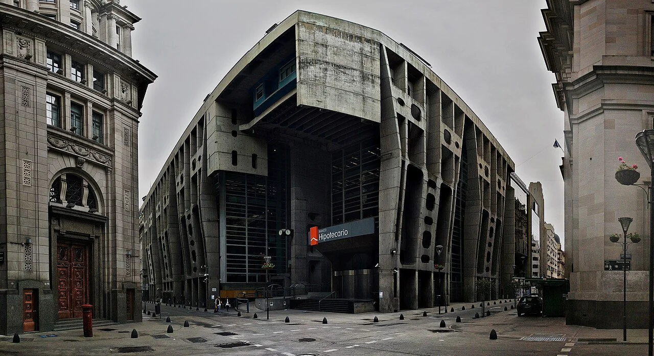
An iconic Latin American example, this heavy concrete office block (Testa/Bullrich/Cazzaniga) shows how Brutalism adapted to urban contexts. Its bold geometric massing and sculpted details illustrate Brutalist principles applied to commercial architecture.
3. Venustiano Carranza Gate, Mexico City (1980s) – Soviet-Influenced Design
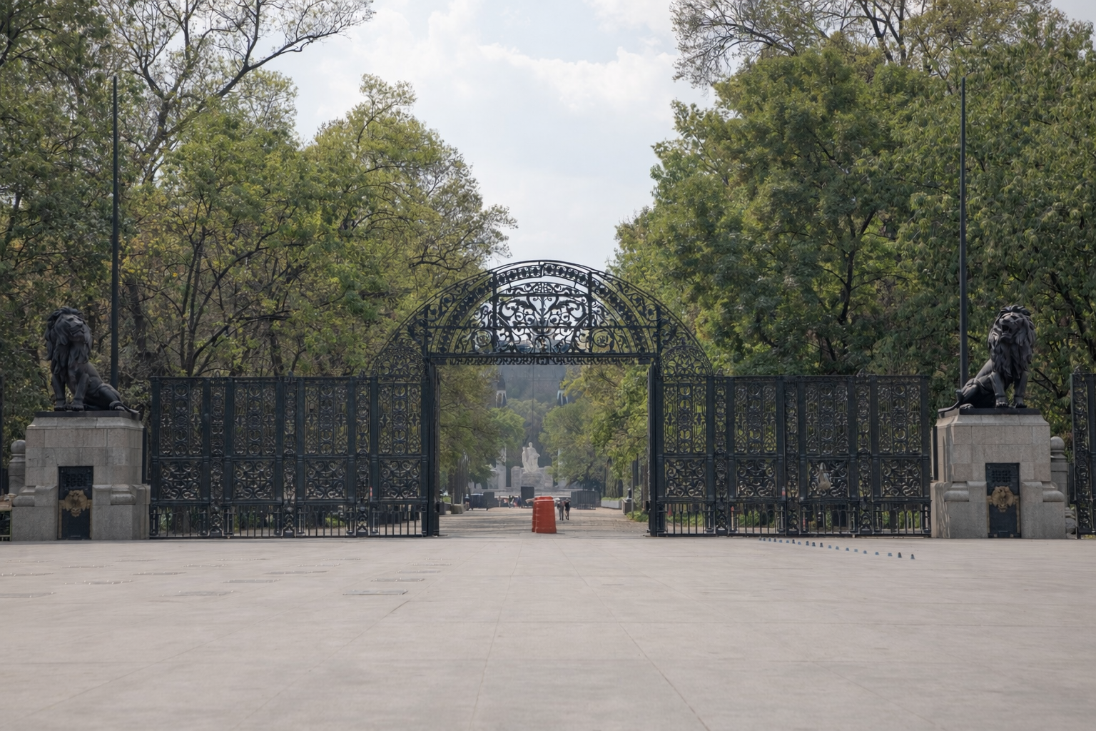
A massive gateway structure in CDMX, often dubbed “Puerta de los Leones,” reflects socialist-era Brutalism. Its unfinished concrete surfaces and looming presence made it controversial, yet it embodies the scale and form common to the style.
4. Adaptive Reuse Example: Boston City Hall (USA) – Saving a Concrete Icon
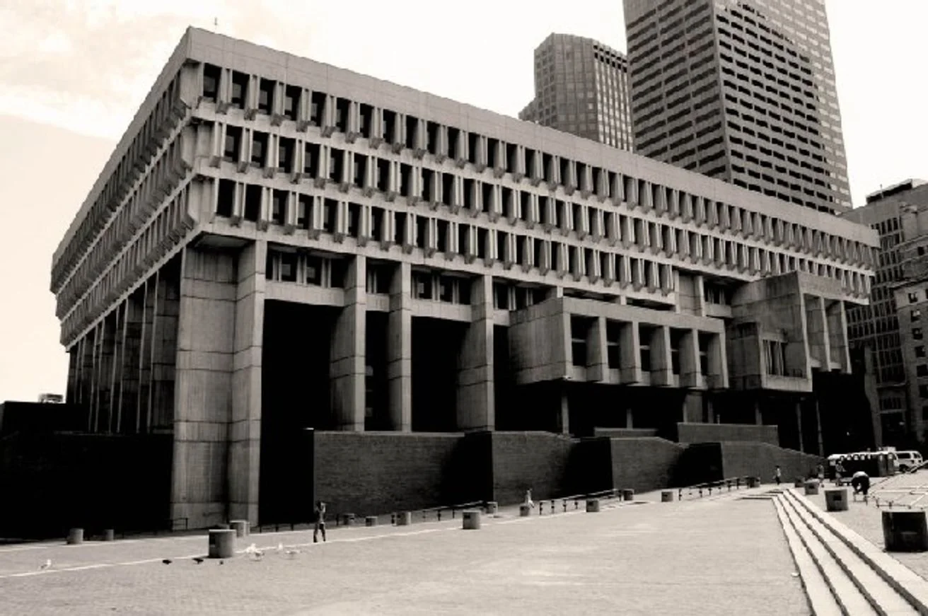
Brutalism’s sustainability potential is now recognized. Boston City Hall (Kallmann, McKinnell & Knowles, 1968) is a high-profile case. Architectural teams have undertaken refurbishment rather than demolition, acknowledging that demolition wastes history and embodied carbon.
Practical Takeaways for Designers
Appreciate Materiality: Brutalism teaches us about honest materials. Use concrete or brick thoughtfully, exposing textures and letting materials speak for themselves.
Use Light and Shadow: Deep-set windows and overhangs create dramatic shadows. Even today, using strong geometry and sunlight can define spaces powerfully.
Plan for Longevity: Like old Brutalist towers, design with future reuse in mind. Sturdy structure means adaptability – consider how spaces can transform over time.
Balance Scale: If you can’t build huge volumes, use heavy textures or bold accents to invoke Brutalism’s presence. A small project can borrow the style’s spirit through material palette and form.
Embrace Context: In warm climates (like Mexico), shading devices and textured concrete help mitigate heat while nodding to the Brutalist aesthetic.

The Essential Home: How Smart Design Makes Small Spaces Feel Bigger, Calmer, and More Affordable
The Problem: Why “Affordable” Often Feels Like “Compromised”
Affordable housing has long been framed as a trade-off.
Lower cost usually means smaller spaces, lower-quality materials, and environments that feel compressed, chaotic, and overstimulating. The result is not just a spatial problem—it’s a psychological one.
When space is poorly designed:
Clutter becomes inevitable
Light is obstructed
Movement is restricted
The issue isn’t size.
It’s how space is organized.
Rethinking Value: Volume Over Area
The Essential Home proposes a simple but powerful shift:
Prioritize volume over area.
Instead of focusing on square meters, the design maximizes:
Vertical space
Visual openness
Light distribution
Functional compression
This creates the perception—and experience—of a larger, calmer environment without increasing cost.
Research in environmental psychology shows that perceived space has a stronger impact on well-being than actual dimensions. High ceilings, clear sightlines, and unobstructed layouts reduce cognitive load and improve mood.
The Science: Why Clutter Increases Stress
Studies from neuroscience and environmental psychology indicate:
Visual clutter competes for attention → increases mental fatigue
Disorganized environments raise cortisol levels
Limited spatial clarity reduces focus and emotional regulation
In contrast:
Open spaces improve cognitive performance
Minimal environments reduce anxiety
Organized layouts enhance perceived control
This is where architecture becomes more than form—it becomes regulation.
The Solution: The “Smart Wall”
At the core of The Essential Home is a single intervention:
The Smart Wall
A continuous, built-in system that runs along one side of the home, integrating:
Storage
Kitchen
Appliances
Closets
Utility systems
What it does:
Eliminates visual clutter
Everything is concealed within a unified plane.Frees the living area
The rest of the space remains open and flexible.Creates spatial calm
The absence of visual noise allows the mind to rest.Improves functionality
Every element has a defined place.
Material Strategy: Affordable ≠ Low Quality
The project uses standard, accessible materials, but rethinks their application:
Plywood → custom joinery systems
Concrete → thermal mass + structural efficiency
Brick → durability + local availability
The key is not the material itself, but how it is composed.
By simplifying construction systems:
Costs are reduced
Maintenance is easier
Scalability increases
Design Hack #1: Hide Everything You Don’t Need to See
The fastest way to improve any space:
Reduce visible clutter by 80–100%
Even in small homes:
Concealed storage = immediate calm
Clean surfaces = perceived order
Fewer visual interruptions = better focus
Design Hack #2: Use Light to Expand Space
Light is the most underutilized “material” in affordable housing.
Strategies:
Maximize natural light entry
Use indirect lighting instead of overhead glare
Keep window paths unobstructed
Light doesn’t just illuminate space—it defines it.
Design Hack #3: Create One Clear Axis
A continuous visual line (like the Smart Wall) creates:
Orientation
Flow
Spatial coherence
When the eye understands a space instantly, stress decreases.
Design Hack #4: Neutral, Warm Material Palette
Overstimulating color palettes increase cognitive load.
Instead:
Warm neutrals (sand, wood, soft gray)
Consistent textures
Minimal contrast
This creates a regulating environment, not just a decorative one.
The Bigger Idea: Dignity Through Design
Affordable housing should not feel like a compromise.
It should feel:
Calm
Intentional
Functional
The Essential Home reframes the conversation:
It’s not about building bigger.
It’s about building smarter.
Your environment is constantly shaping your behavior, your stress levels, and your sense of control.
Even small design decisions—light, storage, layout—can radically change how a space feels.
The question is no longer:
“How much space do we have?”
But:
“How well is that space working for us?”

Architecting the Spring Equinox: Mexico’s Sunlit Traditions
It All Begins Here
The March equinox (March 20, 2026 at 9:46 AM CDT) is when day and night are nearly equal. For the Maya, it symbolized renewal and balance. Many Maya temples were intentionally aligned to the sun. At Chichén Itzá’s pyramid (El Castillo), “Maya architects designed the pyramid with such geometric precision that a deliberate architectural manipulation of sunlight occurs during the equinox”. Specifically, in late afternoon on the equinox the corner shadows of the pyramid appear to form a feathered serpent slithering down the steps. This grand illusion – the Descent of Kukulcán – occurs because the temple’s orientation and angles catch the sun’s rays exactly right.
UNESCO notes that Chichén Itzá’s stone monuments (including El Castillo and the circular observatory El Caracol) reveal the Maya–Toltec world view. The equinox phenomenon is one of the most famous examples of this cosmic alignment. As the Riviera Maya blog explains, “architecture was designed with extraordinary precision to align with solar events. During the equinox, sunlight interacts with temples and pyramids in remarkable ways, creating striking shadow patterns”. In other words, the ancient builders treated sunlight itself as a building material.
Mexico’s spring climate reinforces these effects. March is the dry season on the Yucatán Peninsula, with clear skies and daytime highs of 32–35°C, ideal for sunlit ceremonies. In central Mexico, mornings can still be cool, so equinox pilgrims often combine sunrise rituals (e.g. at Dzibilchaltún) with sunset events at Chichén Itzá.

Light, Balance, and Well-being
Modern science confirms that daylight is vital for health and mood. Studies show that employees in daylit offices report 15% higher wellbeing and 6% higher productivity. Natural light acts as a powerful circadian cue: “Natural light and darkness give our body clocks essential time cues, regulating sleep quality and wellbeing”. In other words, exposure to morning and midday sunlight helps sync our internal rhythms. Research on biophilic design (incorporating nature into architecture) finds similar benefits. One Human Spaces report found greenery and daylight can boost productivity by 6% and creativity by 15%, while also reducing stress. Another study notes that living around plants “reduces cortisol levels and lower stress”.
Just as Maya architects aligned with the equinox for balance, modern designers can harness natural light and materials to create calm, healthy spaces. For example, orienting windows east-west (for equal morning/evening light) and using light-colored, reflective surfaces can flood interiors with sun. Even simple strategies—skylights, clerestory windows, open courtyards—have measurable impact on occupant mood.

Designing Today with Equinox Insights
Drawing from the Maya example, here are practical design tips:
· Orient and Scale Windows: East- and west-facing windows capture low-angle equinox light. At Chichén Itzá, the west-facing pyramid harnesses the setting sun. In your design, use larger west windows or light shelves to bounce spring evening sun deep into living spaces.
· Use Reflective Surfaces and Colors: The Maya used polished limestone for pyramid steps. In homes, light paint and glossy finishes can mimic this effect, maximizing light bounce. Mirrors and glass walls also spread that “renewal” light.
· Incorporate Outdoor Views and Plants: Frame views of the sky (even a small courtyard). Biophilic touches (indoor plants, water features) complement the light to boost stress reduction.
· Layer Lighting by Time of Day: Mimic the Maya rituals by planning different light scenes: bright warm light in morning, subdued lighting in evening. Use dimmers or smart lighting to reinforce natural circadian cues.
· Seasonal Shading: In hot climates, like Yucatán (35°C days), add deep overhangs or adjustable shades so that low-angle equinox sun penetrates, but high summer sun is blocked. This is essentially what Maya temples achieve with their massive stone geometry.
By combining ancient wisdom with modern research, designers create spaces that literally balance light and dark. This balance can improve occupants’ sleep, mood and productivity – a very 21st-century interpretation of the Maya’s “renewal” themes.
Why Your Lighting is Ruining Your Sleep: The Circadian Architecture Guide
It All Begins Here
The Hook — Why Lighting Feels “Off” (Emotional Friction)
Have you ever wondered why you can spend all day tired and yet feel wired at night? Or why you toss and turn even after a long day? It’s not your mattress or caffeine — it’s your lighting.
In the modern world, we constantly live under artificial light: street lamps, overhead LEDs, smartphone and laptop screens. While these light sources help us see better after sunset, they also send mixed signals to our brain — specifically, to our internal clock known as the circadian rhythm. When this clock gets confused, your ability to fall asleep, stay asleep, and wake refreshed falters. Sleep becomes elusive, frustrating, and emotionally exhausting.

The Science — How Light Affects Your Sleep
1. Light and Your Internal Clock
Your body’s internal clock resides in a tiny region of the brain called the suprachiasmatic nucleus (SCN). It synchronizes your sleep–wake cycle with the natural rhythm of daylight and darkness. Light — especially blue wavelengths — acts as the main cue for this system. When light enters your eyes, it triggers a chain of neural responses that tell your body whether it’s day or night.
Artificial light at night, however, doesn’t align with our evolutionary design. It sends the wrong message: it’s still daytime. This suppresses melatonin — the hormone that tells your brain it’s time to sleep — and can delay sleep onset, reduce sleep quality, and throw your circadian rhythm out of sync.
2. The Neurobiology of Light and Sleep
Research shows that intrinsically photosensitive retinal ganglion cells (ipRGCs) in the eye detect light and send direct signals to the circadian clock. These cells are especially sensitive to blue-enriched light (~480 nm) — the kind emitted by screens and many LED bulbs. Exposure to this spectrum late in the evening can suppress melatonin and shift your internal clock, causing sleep timing delays and poorer sleep architecture.
3. Real Evidence: Light Exposure Alters Sleep Quality
A 2023 study demonstrated that people’s light exposure behaviors (like nighttime gadget use or daytime electric light exposure) significantly predict sleep quality, mood, and circadian regulation. Increased light at night disrupts normal rhythms and can degrade sleep depth and consistency.
Another lab-based experiment found that even low levels of light exposure (5–10 lux) at night — typical of streetlights or dim indoor lighting — can still influence melatonin suppression and delay circadian timing. This means that even “soft” light can be harmful to sleep if the timing is wrong.
The Solution — 5 Actionable Lighting “Hacks” for Better Sleep
The good news is that sleep-friendly lighting isn’t complicated. You don’t have to live in darkness — just apply these practical, research-backed adjustments.
1. Embrace Bright Light Early in the Day
Exposure to bright daylight in the morning helps reset your circadian rhythm. Although sunlight cannot always be controlled, spending as little as 10–30 minutes outdoors first thing can reinforce your internal clock, leading to improved nighttime sleep.
Actionable tip:
• Aim for 15–30 minutes of outdoor light within one hour of waking.
• If outdoor time isn’t possible, sit near a bright window.
2. Dim and Warm Your Lighting After Sunset
Evening light should be softer and warmer. Warmer tones (reddish, amber) trigger less melatonin suppression and signal that night is approaching, helping your brain release sleep-promoting hormones.
Actionable tip:
• Use dimmable warm lights (2200–2700 K) after sunset.
• Avoid bright white and blue-rich bulbs in living spaces at night.
3. Reduce Screen Exposure in the 2–3 Hours Before Bed
Screens emit blue light, which significantly impacts circadian rhythms. Many devices have “night mode,” but real impact comes from reducing overall exposure.
Actionable tip:
• Stop screen use at least 90–120 minutes before bedtime.
• If you must use screens, apply true blue-light blocking glasses.
4. Control Light in Your Sleep Environment
Even low-level light during sleep interferes with your internal rhythm. Blocking light sources improves melatonin production and reduces night-time awakenings.
Actionable tip:
• Install blackout curtains.
• Use dim night lights in hallways.
• Avoid LED indicator lights on electronics.
5. Consider Lighting Schedules That Mimic Natural Rhythms
Some modern lighting systems can adjust brightness and color temperature throughout the day, mimicking natural sunlight patterns. These circadian-informed lighting schedules help align the body’s rhythm with the day–night cycle.
Actionable tip:
• Use lighting systems or bulbs that adjust color automatically:
◦ Brighter and bluer in the morning
◦ Dimmer and warmer in the evening
Conclusion — Lighting as “Architectural Sleep Hygiene”
Your lighting environment isn’t a background detail — it’s part of your circadian architecture. Just as the layout, materials, and scale of a space impact your emotional and cognitive states, lighting influences your physiology and sleep architecture.
By understanding and adjusting your exposure to light throughout the day, you can support your internal clock, improve sleep quality, and reduce the emotional toll of restless nights. The keys are timing, spectrum, and consistency: bright in the morning, warm and dim in the evening, and dark at bedtime.